( that is so a part of e design I love so much..once you have all the elements that we've talked about and have been added virtually to your space, you purchase and add them as you can and as budget allows! )
Pamela's front room is right off her entry and is a little more of a formal sitting room-
She was lacking a defined entry so we added a narrow console to act as a spot to pop your keys and mail, and it plays into the living room so wonderfully-
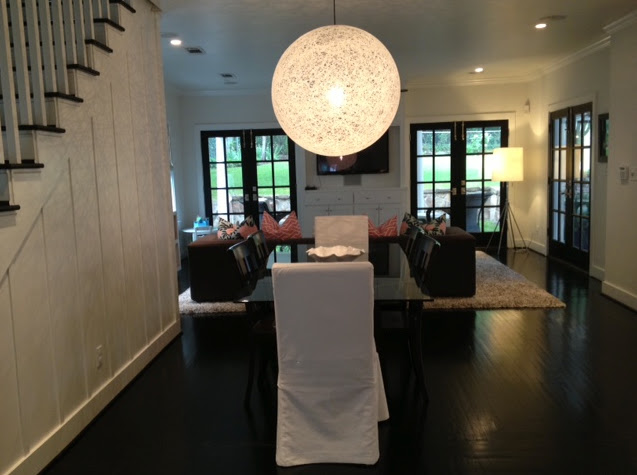
by adding two slip covered chairs to her existing dining room furniture added some softness and made it really inviting-
umm, does a kitchen get much better than this?! We added two amazing lamps to flank the sink and wow do they add alot of character and interest to an ( already amazing ) space!
At the opposite end of the house is a family room that is a little more playful, colorful and cozy. Great pillows, monograms, a cozy rug and marble topped table invite the family to hang out, the kids to play and completes such an amazing living space!
design philosophy | providing a foundation to grow and alter through the years, I keep the core basic and layer in the current, creating a room that is innately yours. I believe great interiors are not found in one shop. I know you should feel a sense of calm in your space as well as balance, and revel in that gut feeling that it’s the right fit. DESIGN SERVICES start at only 10.00. See Sarah Swanson Design at the top left of this blog!


5 comments:
Looks Awesome! So happy to see the final pictures. xoxo
Looks so great, Sarah!!! Beautiful home!
Wow, I love it all! It's always so fun when we get the after photos in our inbox! It's like Christmas for e-designers. :)
FANTASTIC! Love the lamps at the sink.
xo Nancy
Powellbrowerhome.com
It is such a great use of space ! Each and every detail has beauty & function . Great job!
Post a Comment