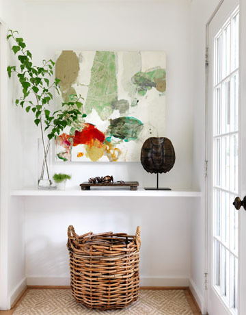
I have always loved this spot in designer Lindsey Bonds Alabama home-
tonight I spied this updated version on House Beautiful.. which do you prefer?
Have you seen the detail in Brooke's new home? Ack.. I'm in LOVE. It's beyond gorgeous..
AHmazing lighting choices from the coveted Visual Comfort- Brooke, your home is incredible!
E DESIGN ( design/ inspiration board via email after lots of on line discussion ) is the perfect option to help you design from scratch, update or finish a room! To see all the details visit Sarah Swanson Design.
Subscribe to:
Post Comments (Atom)


5 comments:
I like the 1st photo of Lindsey's home… so simple.
And, yes - I did see Brooke's home. LOVE it all!!! That black door is so nice. If we weren't renting, I'd do it.
You are too sweet. Love it when someone can appreciate the details... ESP since the house is empty!!!
I LOVE Brooke's gorgeous new home! For some reason, I'm drawn to the 1st image of Lindsey's entry. Clean and simple, just the way I like it! xo
Love the first option !!
xxLily
goldandgray.com
I prefer the second picture. Love the colour the painting adds to the area!
Post a Comment